- 1–2 hrs
- Paper notes
- Camera roll
- Inconsistent
Report - Missed Details
- < 5 min
- Voice → text
- Embedded PDF
- Professionally Formatted
- Captured & Embedded
SaaS Case Study: SiteWalks
Designing an AI-powered field reporting tool to eliminate the “second shift” of paperwork.
The Why:
I Kept Seeing the Same Problem
Field professionals are overwhelmed by fragmented notes and disconnected photos, which pull them away from the work that truly matters. The why was simple: build a real-time workflow that captures, organizes, and delivers a professional report the moment the walkthrough ends.
What if the report just wrote itself?
The Challenge:
A Fragmented Workflow Hiding
in Plain Sight
Professionals across Medical Labs, Facility Management, Retail, Real Estate, and Event Planning conduct site walkthroughs, but the reporting step was fundamentally broken.
- No Structured Capture: Reliance on inconsistent notes and manual photo labeling.
- Administrative Burden: Significant time lost to “post-visit” typing sessions.
- Unprofessional Output: Clients received generic documents lacking visual structure or context.
SiteWalks has completely changed how we handle site reporting and field documentation. Easy to use, highly organized, and our team can document observations, track progress, and share updates in real time. We have increased accountability, reduced delays, and improved the quality of every walkthrough. It has become an essential tool for keeping our projects on track.
The Solution:
“Walk. Talk. Snap. Done.”
I designed a zero-friction, voice-first capture flow that automatically outputs a branded PDF, requiring no typing in the field.
- Select Industry Template: Users choose their category, which tells the AI which language and categories to use for the report.
- The Walk: The user narrates observations freely while snapping photos of specific issues.
- The Brain: The app converts voice to text and automatically sorts issues into buckets like Maintenance, Safety, Compliance, or Aesthetics.
- Instant Output: A branded PDF is generated within minutes, categorized sections, and photos embedded next to relevant text.
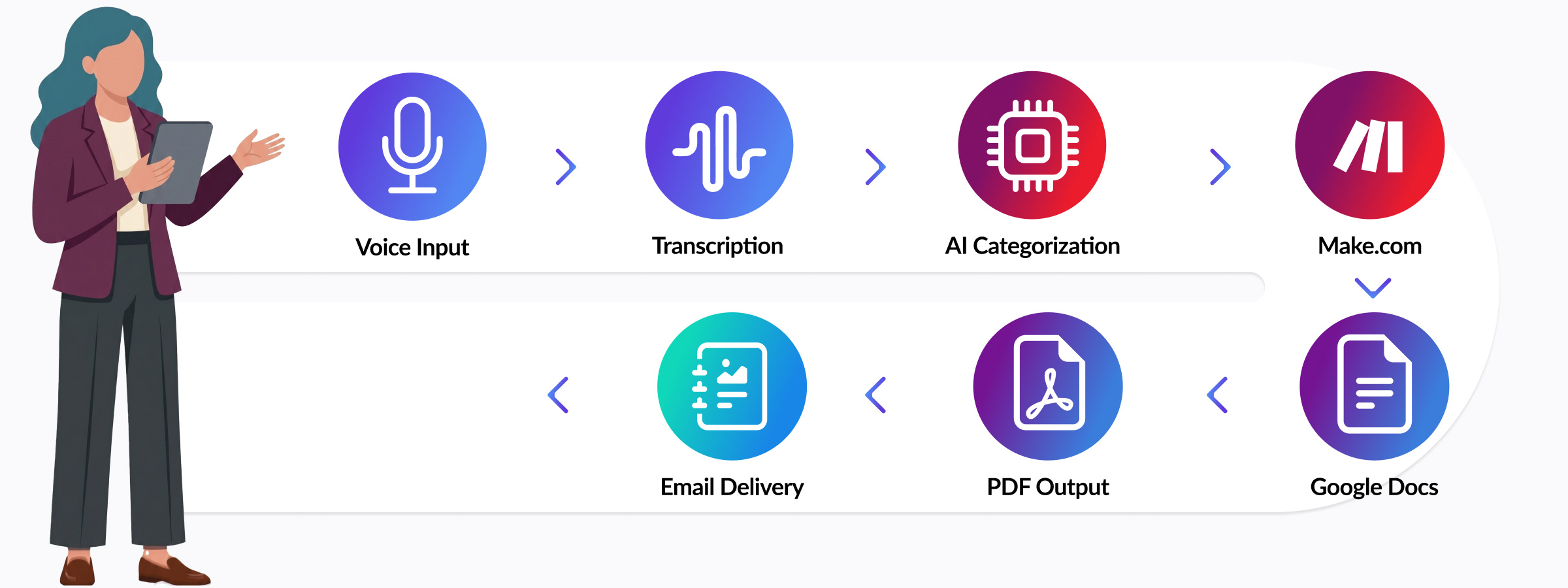 End-to-end workflow: voice input to PDF delivery.
The Process:
From Research to Brand System
I interviewed industry professionals to ensure the workflow solved their specific administrative pain points. I then developed a brand system to match.
- Visual Strategy: Anchored in deep purple for authority and precision, paired with a cyan-blue accent to symbolize speed and technology.
- Logotype: Created a lowercase italic wordmark paired with a bold "W" icon, its shape abstractly echoing a sound wave, connecting the mark directly to the app's voice recording experience.
- The Tagline: “Walk. Talk. Snap. Done.” became the brand’s heartbeat, dictating every touchpoint from social ad creative to the internal UI.
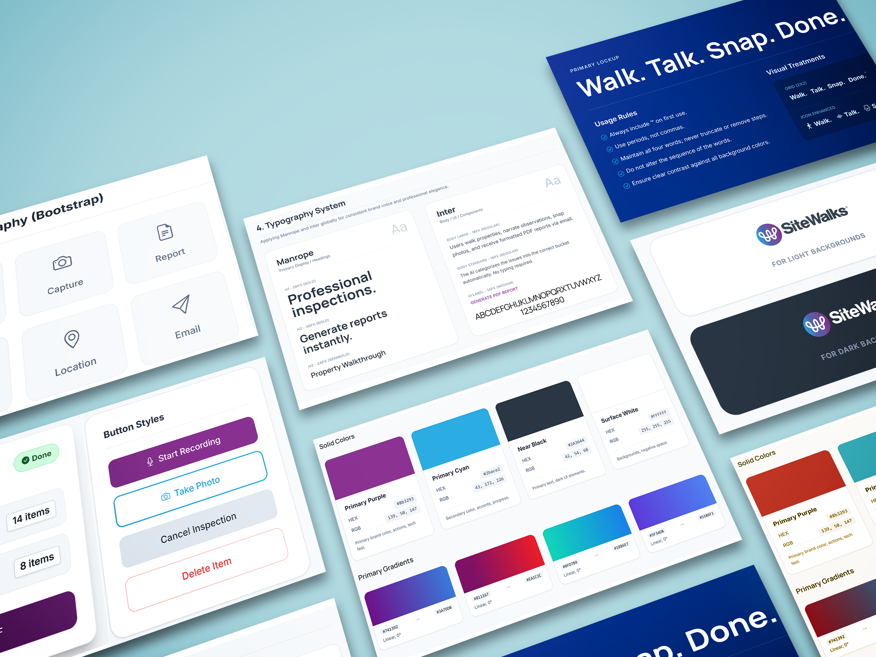 SiteWalks brand system and UI component styling.
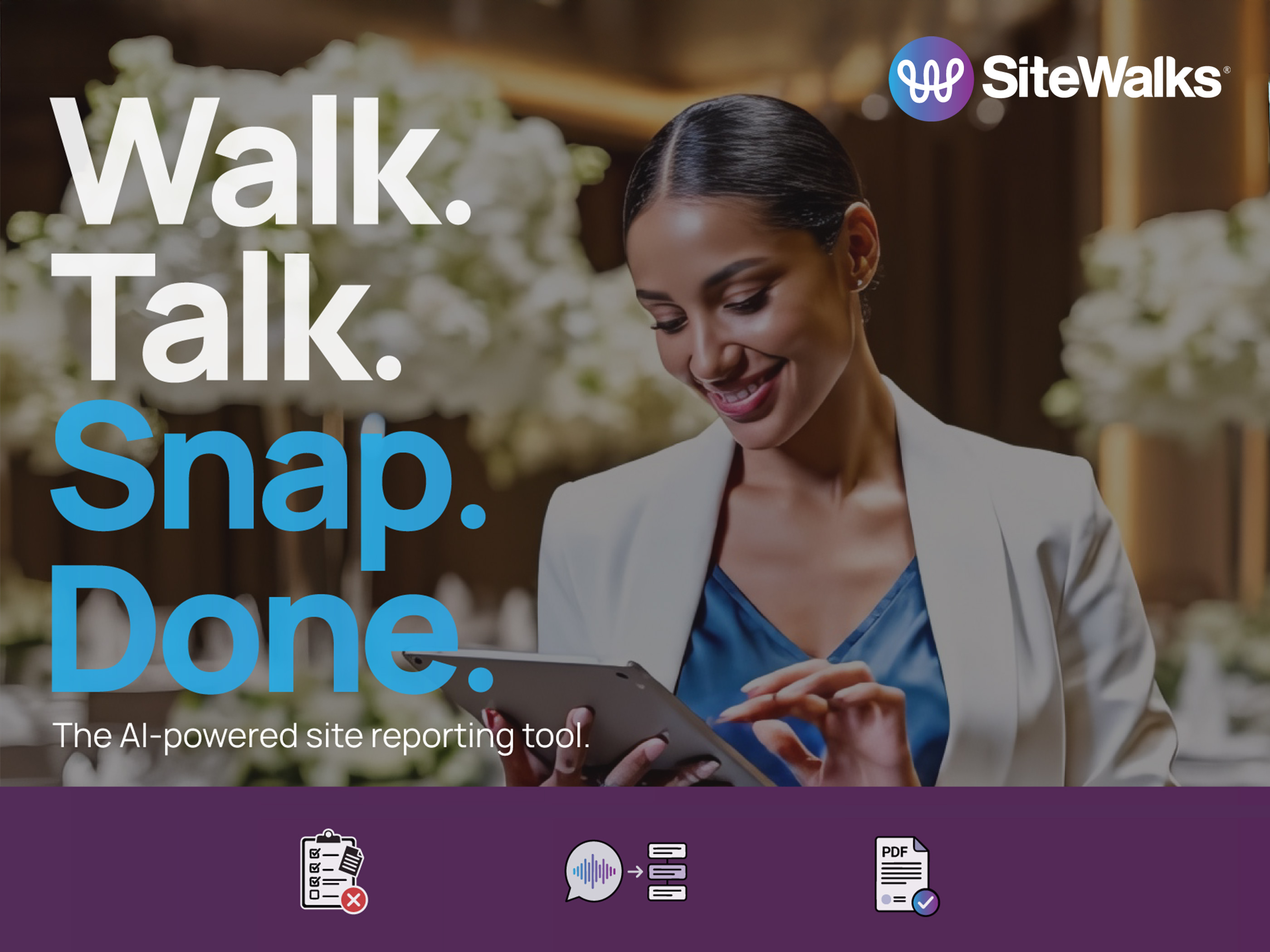 Brand promotional material featuring tagline.
Build & Constraints:
Constraints as Catalysts
Constraints: The Glide.appNo-code mobile app builder used to design and deploy the SiteWalks front-end. Voice Transcription component and SiteWalks’ core feature disappeared from the builder repeatedly, with no error or warning. Root cause: user session behavior combined with Glide’s manual sync dependency caused publish updates to fail silently, leaving the component in an unregistered state.
UX Trade-offs: Glide’s one-action-per-button limit and inability to trigger Make.comAutomation pipeline connecting voice input, OpenAI, Google Docs, and email delivery. webhooks with custom parameters forced simpler, more linear user paths — which ultimately reinforced the zero-friction goal.
Functional Backbone: A lean Glide front-end feeds into a Make.com automation pipeline, routing voice input through OpenAIAI engine powering voice transcription and automated report categorization. for transcription, generating structured reports via Google DocsPDF report template engine — structured, branded, and consistent across every report output. templates, and processing payments through StripePayment processing and subscription gating for the 7-day free trial and monthly billing.. Five tools, one coherent system.
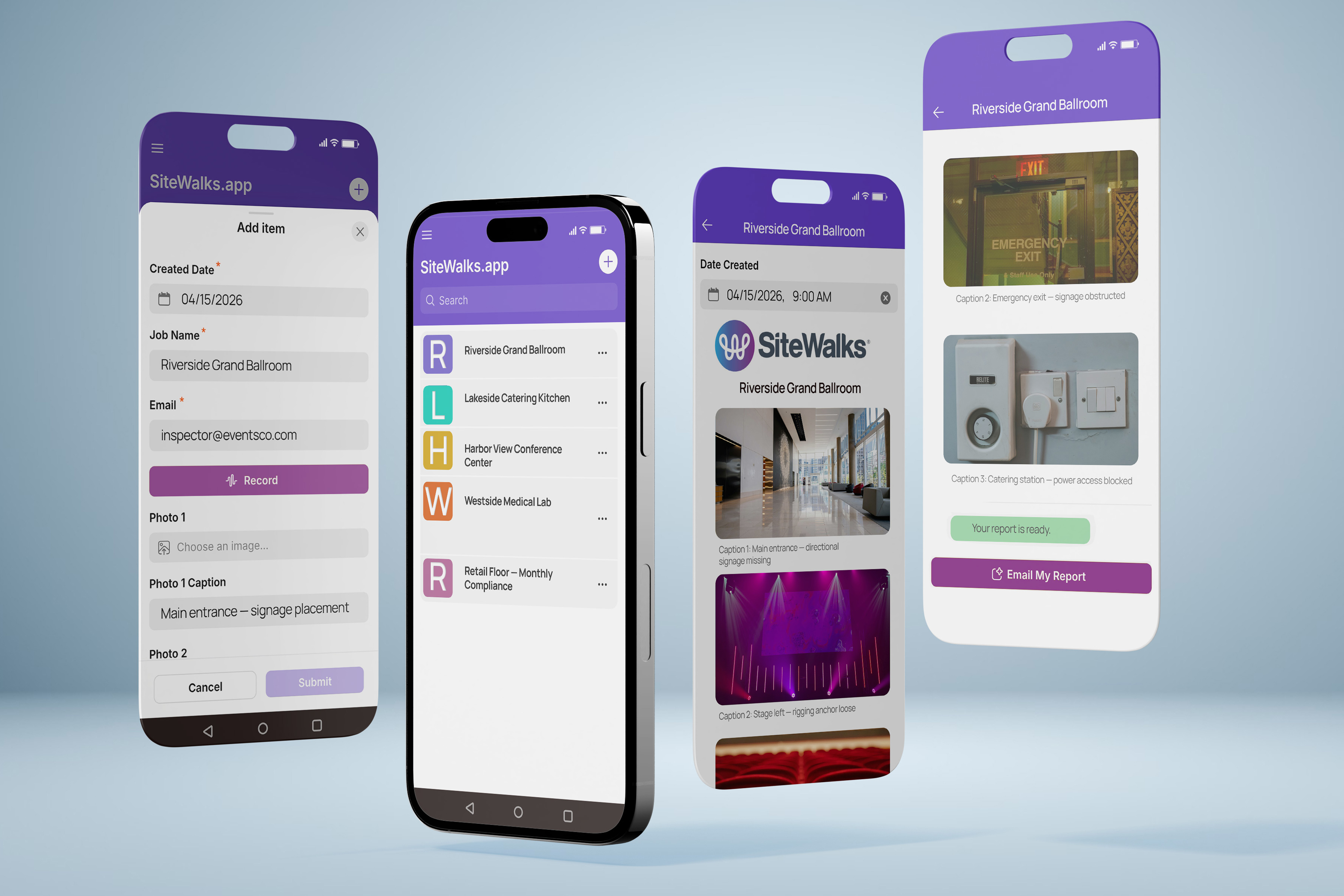 SiteWalks.app job capture form, walkthrough list, AI-generated report, and one-tap email delivery.
The Outcome:
Shipped. Validated. Live.
The result of my end-to-end build:
Design Insights:
What I Learned
Brand clarity accelerates everything
Locking in the brand system early meant every design, ad, and copy decision had a filter. Clarity upstream saves time downstream.
Validate the automation, not just the UI
The Make.com pipeline — voice → transcript → PDF → email — requires end-to-end testing before declaring anything done. Partial confirmation is not confirmation.
Platform constraints are design constraints
Glide’s one-action-per-button limit forced simpler, clearer UX flows. What felt like a blocker shaped better product decisions, fewer options, and cleaner paths.
Distribution is a design problem too
Building a great product is only half the work. Getting it in front of the right people requires the same intentionality as designing the product itself. Audience targeting, channel discipline, and platform mechanics are design decisions, not afterthoughts.